
Редакција
The icon of the Entry into Jerusalem
By Michael Galovic
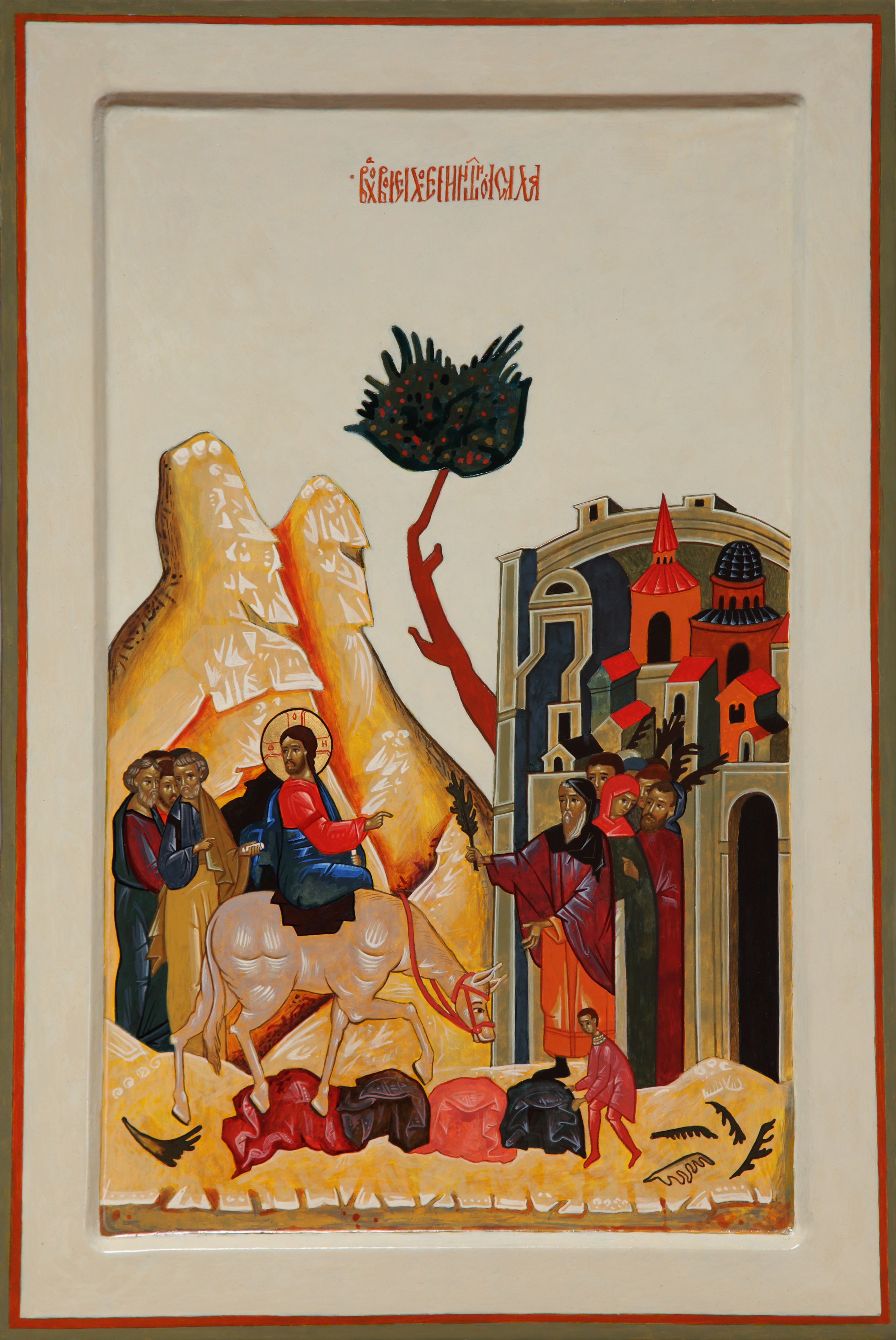
One of the Lord’s and also among the Great Feasts, described in the Gospels, apocryphal texts, liturgical and hymnographic literature, icons of the Entry (less often called: The Entrance) into Jerusalem are very festive and triumphal, as well as multilayered with meaning. Having just raised a man dead for four days, and before his ultimate Kenosis (‘self-emptying’ of Jesus’ own will and becoming entirely receptive to God’s divine will; self-renunciation), Christ is welcomed into Jerusalem as the Messianic King of Israel. He makes the triumphal entrance of a ruler, as prophesied in the Old Testament: “Rejoice, greatly, O daughter of Zion! Shout aloud, O daughter of Jerusalem! Lo, your king is coming to you; triumphant and victorious is he, humble and riding on an ass, on a colt, the foal of an ass.” (Zachariah 9:9).
Astride a donkey, Jesus descends from the Mount of Olives with His apostles; before Him are the city of Jerusalem, the crowd of Jews, with children gathering palm branches and laying out cloaks at His feet. Christ enters the city in triumph, while feeling the hostility of those who hail him today and will crucify Him tomorrow: “Now I enter the city and, casting you out, I shall reject you – not that I hate you, but because I discovered that you hate me and mine” (Romanos the Melodist, Kontakia). The Procession of the Palms can be understood as a “description of a mystical transition” (Richard Temple: Icons and the mystical origins of Christianity).
Making an icon of such aesthetic beauty, which is also heavily laden with meaning, has been on my mind for a long time. Yet, it had to be my own creation and not a replica of an existing one, despite the many great achievements from the past; elements from various old icons were used coming together in a new guise. The making of this special piece came with a great joy; I detected in myself no eagerness to bring it to completion and to rest; instead, I would keep coming back for more fine-tuning, relishing the process immensely!
The format of my board (50x34cm) asked for verticality and provided generous space above the protagonists of the Palm Sunday drama; very often we have the mountain, the tree and the city at the same height, but I had a leeway there and gave each of them a different height, thus aiming for optimal dynamism. Instead of the expected gold background, which has become overly used, I opted for a pale, ivory, off-white background, achieved through application of many fine layers of pigment combined with egg yolk, creating the luminosity and translucency which I wanted as the primary quality; all elements, or most of them, had to look ethereal and otherworldly, as the case should be with icons in general. This is best achieved with egg tempera; other mediums such as oil and acrylic cannot deliver the same results. It is worth mentioning that gold backgrounds and the gilding of the whole icon became prominent around the 15th century and stayed on, for the obvious reasons of giving the icon a sacred and precious aspect, and certainly one of invaluableness, although the colours white, pale green, green and red are symbols of Divine and were very much used, especially in the Russian iconography, before gold became the norm. Here, it is worth reminding ourselves that the Russians embraced Christianity at the end of 10th century and inherited their ecclesiastical system from Byzantium, including image-making in the form of icons. For a few centuries, Byzantine iconographers were introducing Russians to the complexity of iconography, and themselves painting icons in Russia for centuries (we need only to recall Theophanes the Greek, a giant among medieval iconographers and a beacon for posterity).
As per convention in this icon type, my Saviour rides side-saddle on a colt. He holds a scroll in His left hand, as a king, and is blessing with His right, as a priest. The chiton, being of the colour red (Divine nature) and the chimation of blue (human nature), represent the traditional chromatic symbolism of the Lord’s dual nature, God and man. In my icon, He has slightly concerned facial expression which is an allusion to His awareness of the immanence of His passion. One does not find this in all icons; in many cases, the Lord’s face is serene and majestic. By the same token, we often find saints depicted in icons with a hint of tension or anxiety even though the scene does not seem to warrant this; in these cases, slight shifts and movements (especially of the eyebrows) indicate a rich inner life and spiritual dynamism. Minimalism of expression in iconography can be likened to a number of Oriental traditional dances (Japanese No and Butoh, for instance, or some Hindy dances), where the slightest movements of body parts, eyes, eyebrows, etc, are subtle representations of different emotions and emotional states.
My Saviour is positioned on a golden mean line, which I frequently use in my compositions. His head is turned back towards his disciples while the blessing hand points to the crowd, with Jerusalem as a backdrop. The masses of mountains are balanced out, with the city intentionally slightly asymmetrical, a favourite devise of the Byzantine masters. This asymmetry may be seen as “imperfection” but is a well known, immanent tool of ancient iconographers, and is easily discernible from imperfection stemming from ineptness and lack of skill and experience. Again, we can liken this phenomenon to the Japanese Wabi-Sabi concept of intentional imperfection as an philosophical and ultimate aesthetical concept .
The lines which appear to us as straight are never done with a ruler, nor are they really so clinically straight; they are also part of the “intentional imperfection”; even the halos used to be drawn and painted by hand and at times made to look unacceptably imperfect as if done by a child’s hand. The approach to halos changed after the 14th century and ever since the halos have been incised by a divider, the only technical prop iconographers use for the graphic/drawing part of the process. As to the colour of halo lines, they are usually red but certainly not always; in this icon, I used the dark colour which also features in icons and especially in frescoes.
The Lord’s donkey is a symbol of docility and humility - a horse would be more appropriate for a king or military leader/victor to further enhance an ostentatious impression. Oddly enough, the Russian iconography often depicts a horse rather than a donkey. Similarly, St George is depicted slaying a serpent, rather than a dragon and, while everyone else presented St Christopher with a dog’s head, Russian iconography uses horse’s head. So, the Form may not be the same and it changes as conventions change, but the Essence remains the same, as Tradition and a trained eye should be able to read all these symbols regardless of the country, school, or century, thus voicing the ever unified Byzantine art of icons.
Neither the disciples nor the crowd are multitudinous as icons are less illustrative than western depictions of events and aim for a symbolical representation, rather than a literal one. At times, we can have the clutter of objects and details reduced to the bare essence, as in the Holy Trinity icon by Rublev; whereas in many other versions we see a table generously filled up with items, in his famous icon all there is on the table is the chalice with the sacrificial lamb. This same type of symbolic representation can be used in scenes of the Last Supper (which in the East is known as the Mystical Supper) where the fact of the last meal is irrelevant compared to the Eucharistic initiation that occurred during the event; hence, there is no need for plates, food items, cutlery and so on, just bread and wine.
The mountains carry such a significance in icons: Horeb, Tabor, Mount of Olives ... being the realm of God. They are imaginary and creatively devised with abandon, looking artificial and out of place, often with white-capped cascading slopes, at times evocative of lunar landscapes, and certainly at odds with the mountainous landscape and climate of the Middle East and Israel. This form of representation is one of the devices utilised to bring us closer to that other realm, which ought to be different from this earthly reality. Apart from white highlights, iconographers of the past often used the colour red as well, Russian masters in particular, as it is a reminder of Christ’s blood, His divinity and the Resurrection. My mountains replicate some of these features, while the tree between the mountains and the city tries to follow its own diagonal, as to balance out the two masses. Jerusalem is also depicted as a fictional place, with its imaginary and dream-like architecture, which has often echoed the local architecture, depending on whether the iconographer was Greek, Russian or from some other place.
Sacred literature talks about the “heavenly Jerusalem”, which is not to be confused with the historical and geographic Jerusalem (Richard Temple: icons and the mystical origins of Christianity). “Christ is ... the tree of life that bridges the gap between the mountain of God and the city of man...” (Alfredo Tradigo: Icons and Saints of the Eastern Orthodox Church). In the Christian exegesis the Entry into Jerusalem is understood as the prototype of the entrance into the Heavenly Jerusalem; therefore, this icon is not only the outer expression of the event but a precursor of Christ’s Second Coming, where Jerusalem is the Heavenly Kingdom. The architecture of Jerusalem in icons is naturally almost infinitely varied, but among the other buildings within its walls, we often have the temple of Christ’s Tomb and the Resurrection, built in the 4th century AD. This shows how Eastern iconography can be anachronistic, as it does not concern itself with the “reality” of historical events but rather with the significance and the meaning of certain symbols.
The blackness of the cavern in the mountain is repeated several times in the doors and windows apertures of the city to the right of the icon. As per the Tradition, they speak of the “primeval chaos and confusion before the Light of Revelation”, about the death of our Lord which is a station on the way to the Resurrection, they could be the representation of the lower nature of man which is to be conquered on the transition to the Kingdom. Mind you, the black is never a pure black, just as white is never a pure white (nor is any other colour in icons pure, each being a mix of two or more different colours). It is actually not necessary to use even a smidge of the colour black when aiming for the dark hue; it very much depends on the surrounding chromatic context giving us the impression of black or white.
The children were not mentioned in the Gospels; however, their depiction in the liturgical poetry and apocryphal texts is to be understood as a recognition of the Messiah even by the newly born ones, although there are other suggestions as to the symbolism. In my icon there is only one child laying the garments in different colours with the obligatory red among them symbolising the future spilt blood of Christ but also drawing on Byzantine symbolism (Christ as emperor), or the Old Testament, where it was an act of honouring the King of Israel. Palm leaves and branches are widely recognised symbols of victory, both physical and spiritual. They also symbolise the victory over one’s own lower or human nature.
My firm belief is that icons can be written with a passion, albeit a well-restrained one, but passion nevertheless. Add there love and harmony within (despite the challenging January heat) and you can imagine what a gift it was to enter the new year with this particular icon, which I dedicate to the departed loved ones who are greatly missed.
Michael Galovic, January 2018, Australia

Коментари